The real purpose of graphic design is to convey messages. A design can be extremely pleasing to the eye, but if it doesn’t send the right message, it doesn’t accomplish anything. When you look back at the history of graphic design, especially advertising, you will notice that the designs reflected the state of the world quite well at the time.
The styles were different then because the needs of the people who watched them were different. For example, neon shapes and inscriptions from the 1980s cannot be used to instill a sense of patriotism in people during World War II.
Looking at some of the iconic designs over the past decades, you will see how much graphic design has evolved with the world around us.
1940
One of the most notable examples of graphic design in the 40’s can be divided into two groups. Designs about World War II, especially the propaganda and advertising boom that followed the war. The design as a whole during this period is intrusive. The ads included less text and instead relied on huge and often shocking slogans.
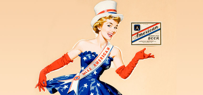
The topic of patriotism is relevant not only during the Second World War, but also in the following years. Although commercials still mentioned the war years after it ended, the designs seemed more optimistic and encouraging. The economy has developed relatively fast, which means more production. This, in turn, led to the need for advertising and packaging design, and advertisers were waiting for just that – an opportunity to convey positive, often patriotic messages.
1950
Design in the 50’s had a little of everything. The whole decade is crowded with interesting and often strange designs. Sex became an extremely huge means of advertising, especially with the publication of the first issue of Playboy magazine. Sex has often been used to sell things from cigarettes to socks. Designs also had the theme of “nice, happy people” in advertising, so if there is a product with a woman on it that for some reason is not sought after and sold, the number with the family sitting around the table passes without any problems. The more kitschy, the better!
One of the best graphic designers at the time was Saul Bass. Bass is widely known for his movie posters and some of the most notable logos in American history. He is also known for making the ordinary extraordinary, and his unique style has influenced a number of designers since then.
1960
If we try to choose one type of design as the most impressive of the 60’s, it will be very difficult. Cultural wars and activism have been everywhere and everything from human rights to drugs and the environment have been hot topics of debate. On the one hand, advertising takes a more modern path. Instead of bold images and texts, there were clever ideas and great concepts.
On the other hand, bright colors and psychedelic graphics have been seen quite often, especially in the music industry.
1970
Music was the most important feature of the 70’s and some of the most famous posters and album covers were created at that time. The psychedelic style, born in the 1960s, continued to flourish along with typography.
During this period, technology also sees light to a great extent. We can see more color photographs used in the design, thanks to advances in camera technology. At the end of this decade, Apple ads, which were quite fashionable at the time, popped up everywhere, telling us how we could have a computer just for ourselves!
1980
It’s hard to imagine a decade other than the ’80s trying to look cool (with varying degrees of success). This was an interesting time for design, as this period had its own distinctive style. Think of geometric patterns, bright colors and neon signs. All this has attracted people’s attention.
Another important aspect of ’80s design is that it speaks to women in a way it has never done before.
1990
This was a pretty crazy period for design. From commercials to television and fashion, everyone looks like they’re the man next door. It was all a mix of funny and embarrassing. The typography was either slightly dull or handwritten, and the colors were contradictory.
Let’s not forget that 1990 was the year when the first version of Photoshop appeared. It could only be used on a Macintosh. The birth of this new tool has allowed designers to experiment with new things, such as overlapping text, faded elements and overlays (or “layers” as we call them more often).
Conclusion
There is no denying that each design style in recent decades has been unique in its time. It is difficult to say who is the best and best looking, but everyone has managed to convey and reflect the then state of the world in a very pleasing to the eye. Nowadays, the style of design is radically different from before. For example, the design is much more clean and modern, minimalist. No one knows for sure what the future of design is, but expect to see a growing wave of designs that will make the user experience better and more exciting.